marcjamesfoster.com


SLCo.

SLCo.

Student Loans Company platform redesign

The Challenge

Redesign the Student Loans UK experience to make balances and repayment schedules easily accessible, while using an AI assistant to provide instant support.

Project Summary

The Project

Prompted by frustrating interactions with Student Loans UK, I created a conceptual redesign focused on clarity and structure. The main goal was to simplify access to critical details like loan balances and repayment schedules, while making it easier to get answers to basic questions.

The Role

I created the end-to-end UI/UX design, using my first-hand experience to ensure the new interface directly solves real user pain points.

AI Assistant

The Problem

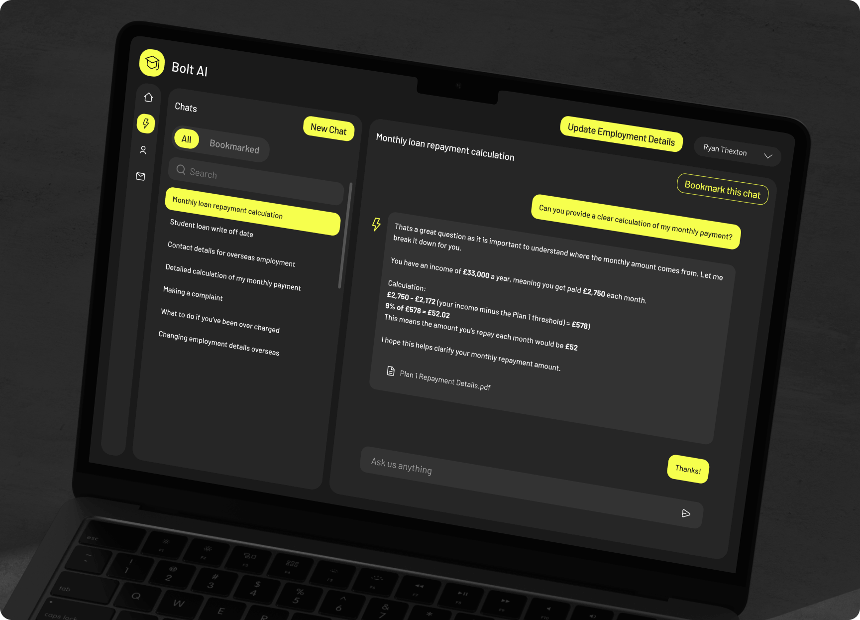
Crucial information on the current site is deeply buried. This redesign uses an AI assistant to deliver instant, accurate answers—complete with a bookmarking feature to save key details for later.

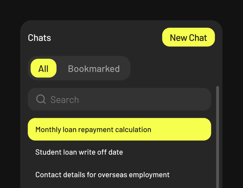
Chat History

Users can search their full chat history to retrieve past answers, or bookmark key responses for instant access later.

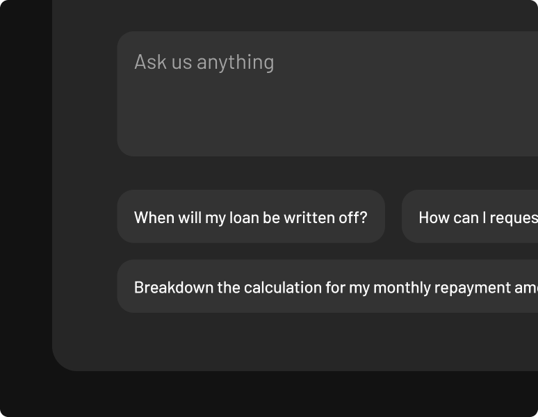
Suggested Queries

Suggested prompts below the input field guide users through common questions with a single tap.

Why it worked

It unified a fragmented experience into a single destination. With instant answers available in one place, users always know precisely where to go—and get what they need immediately.

Key Figures

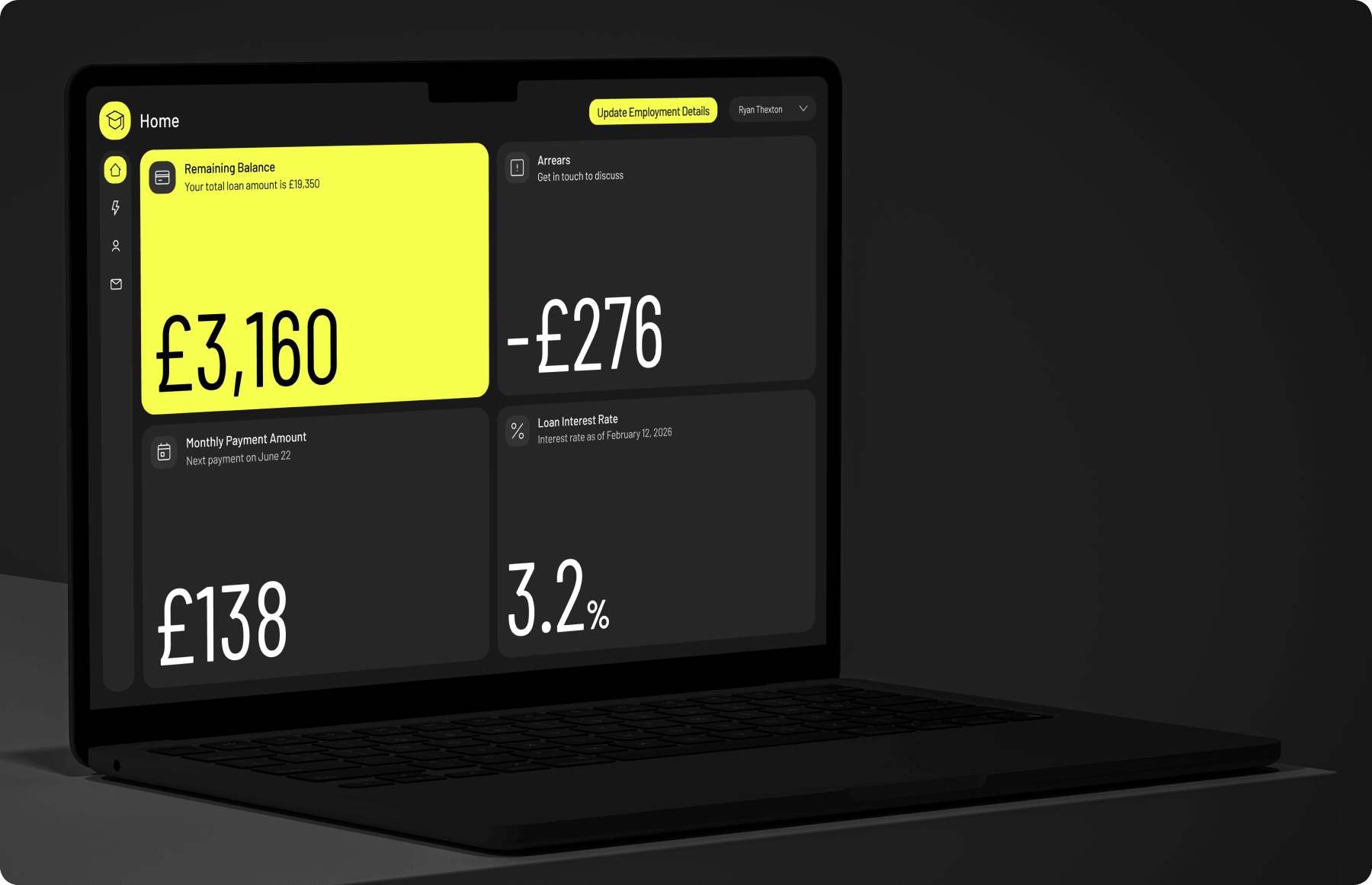
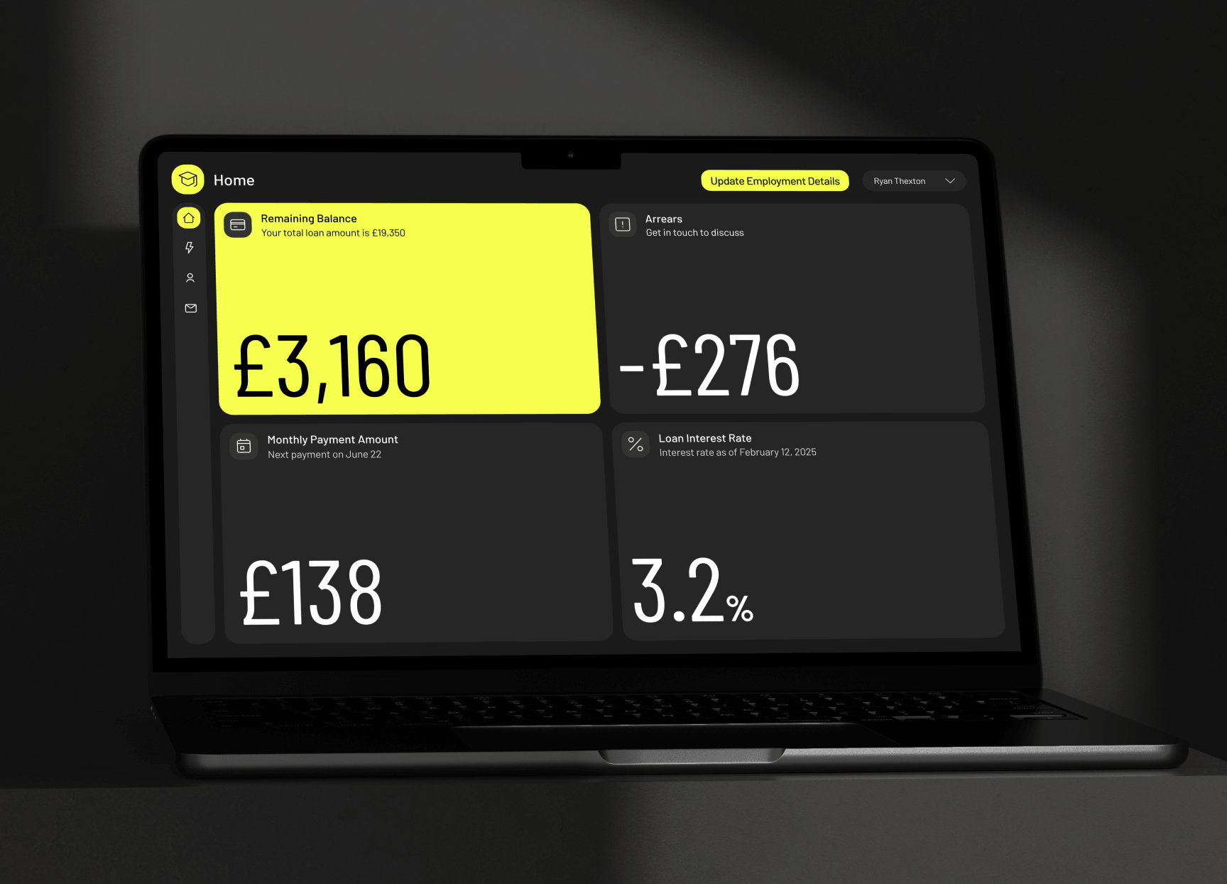
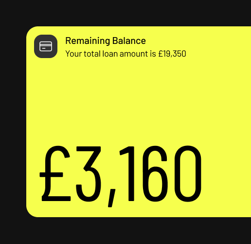
Total loan balances and payment schedules are moved out of dense text blocks and onto the home screen—giving core financial KPIs generous screen real estate for instant clarity.

The headline figure

Highlighted visual styling immediately draws the eye to the user's most critical loan information.

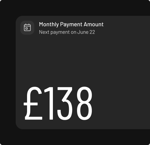
Additional key figures

The KPI card surfaces two core details at a glance: the monthly payment and next due date.

Why it worked

Surfacing essential data points in prominent KPI cards aligns with how users check financial apps. They open the app, get instant reassurance on their balance and due date in milliseconds, and move on.

Update Details

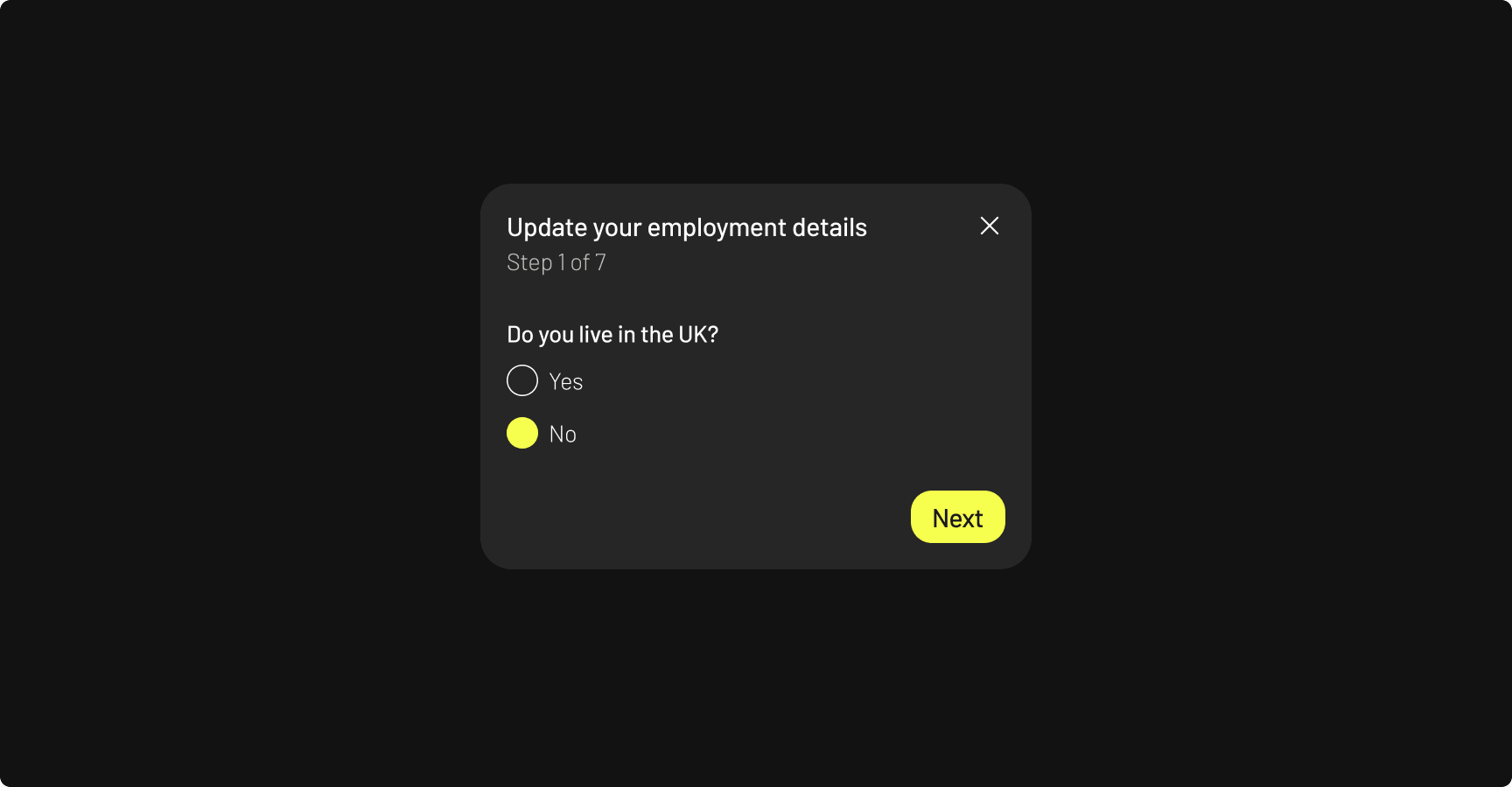
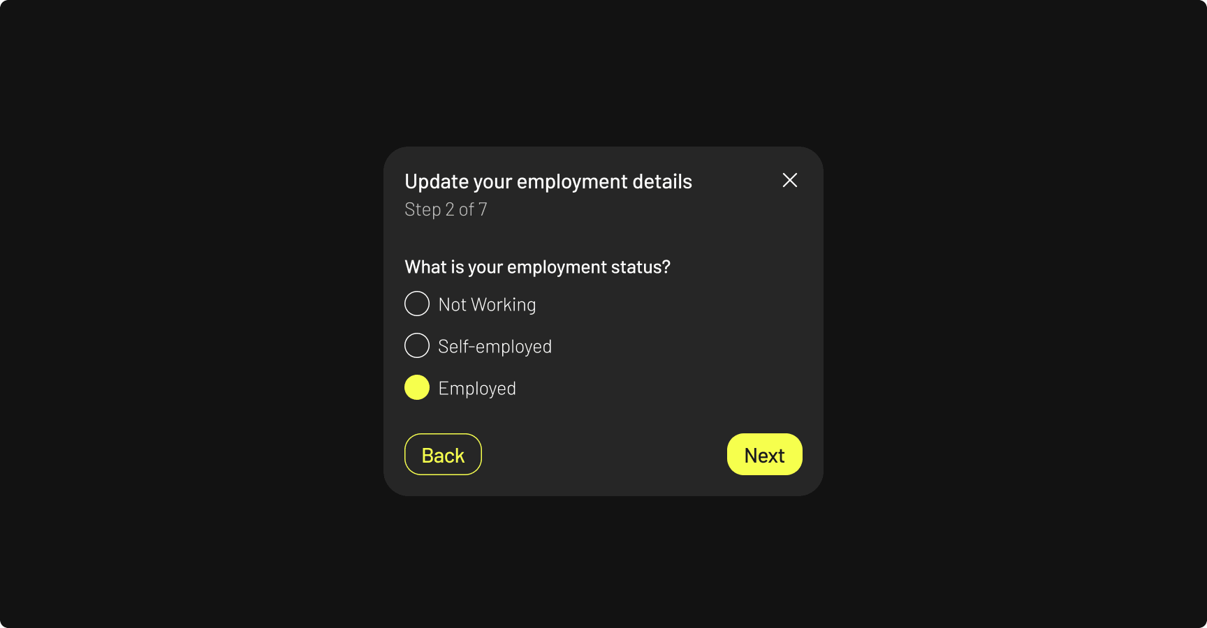
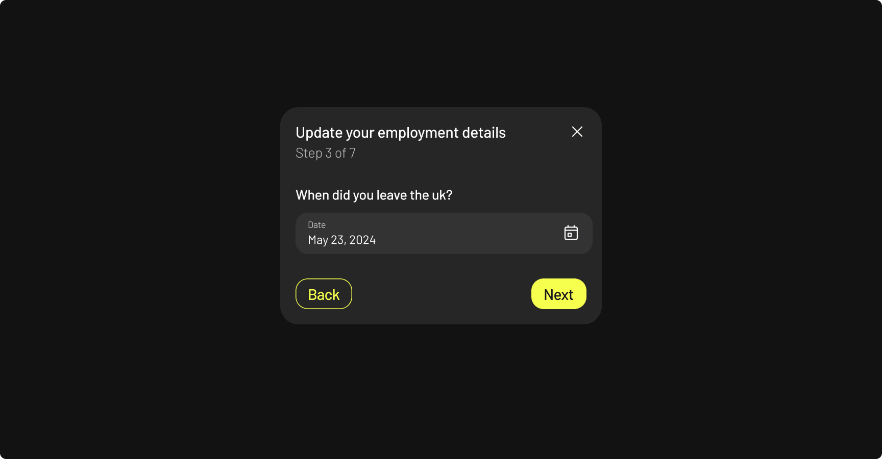
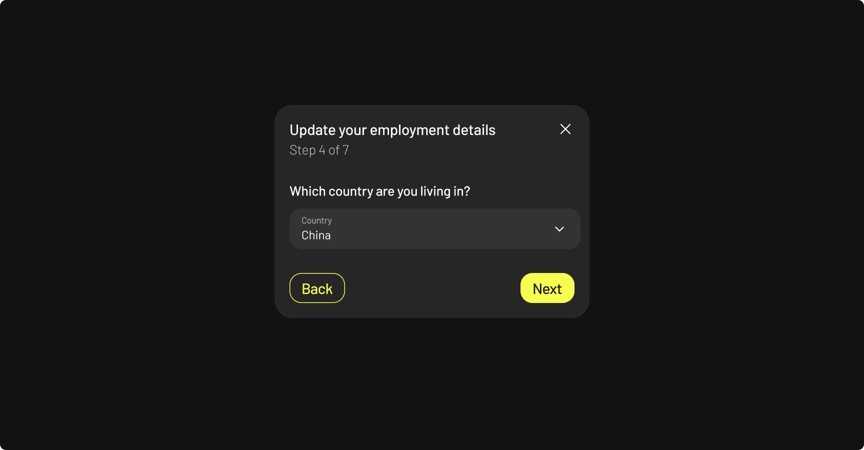
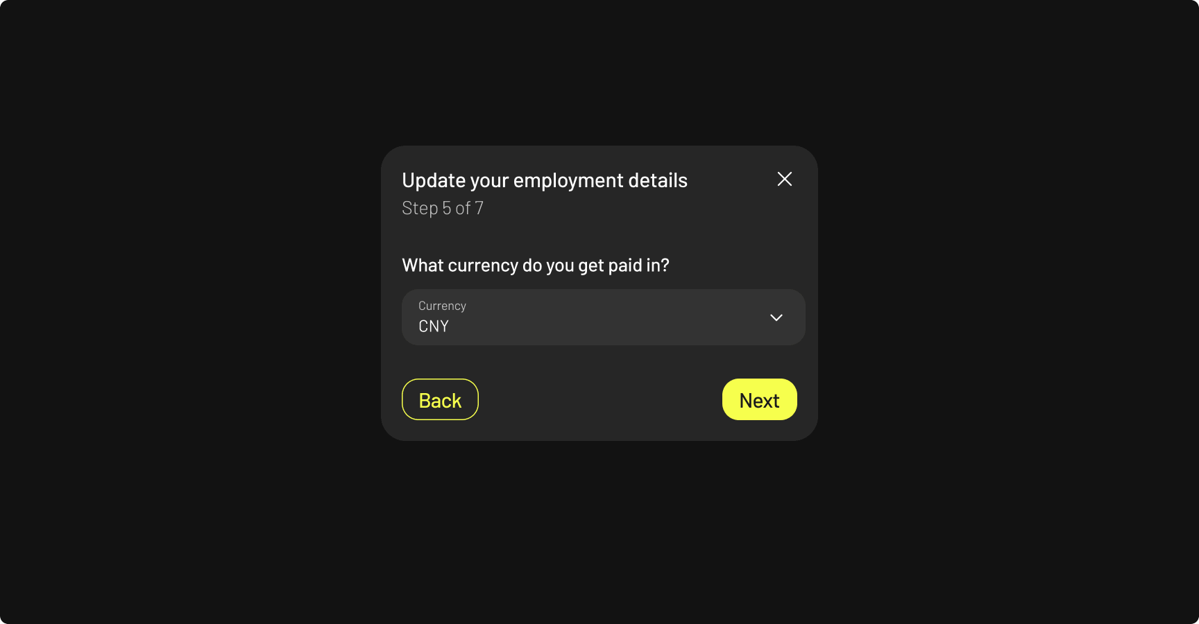
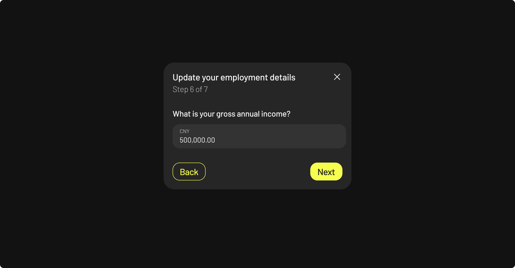
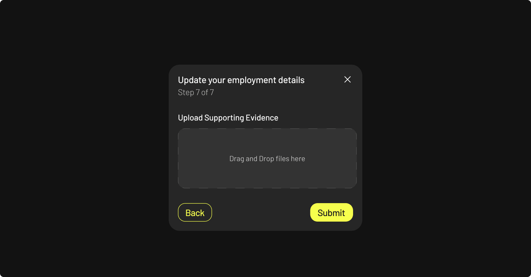
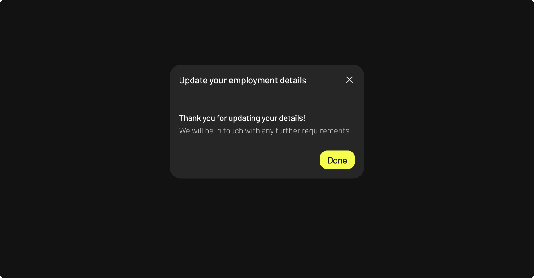
Updating employment details is a primary user goal, but was bogged down by a 12-step process. I stripped away redundant screens to focus solely on essential inputs.

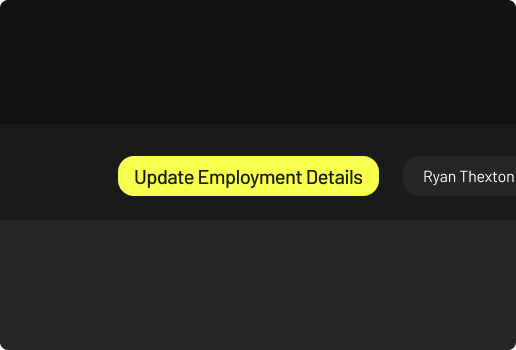
Primary CTA Visibility

Because updating details is a primary task, the CTA sits in the header for instant, universal access.

Minimised steps from 12 to 7

Fewer steps and a clear progress indicator keep users informed and moving forward smoothly.

Why it worked

Cutting unnecessary steps paired with transparent progress tracking eliminates "form fatigue." Users always know where they are and how close they are to finishing—drastically reducing drop-off and friction.

Correspondence

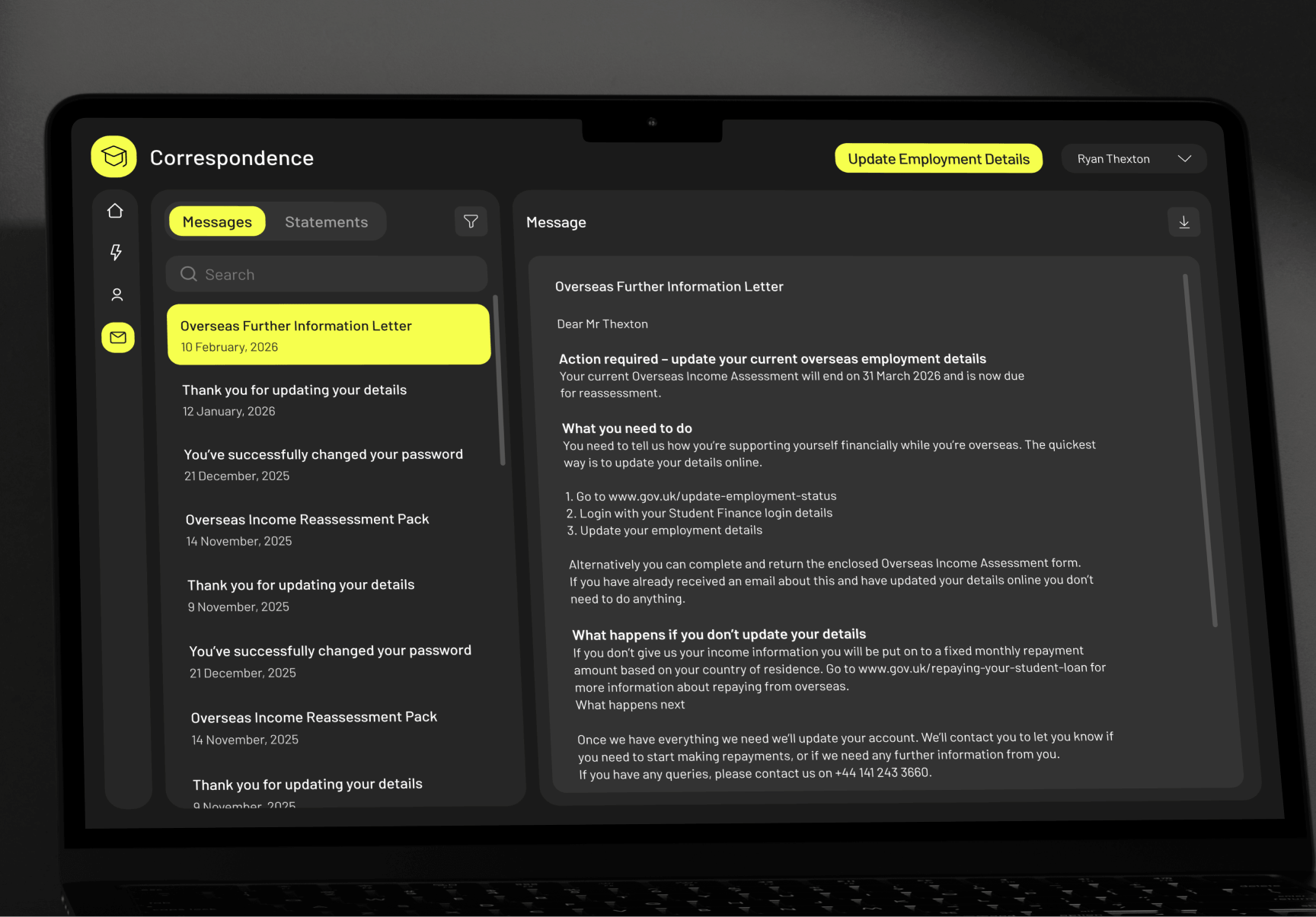
Toggling across different pages and forcing file downloads made viewing correspondence frustratingly slow. Consolidation into a single dashboard with an integrated viewport now lets users preview documents instantly and download only if needed.

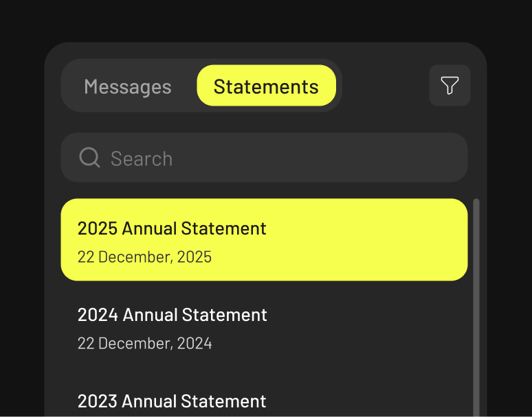
Simple filtering and navigation

Integrated search, tabs, and filters make locating specific statements or messages effortless.

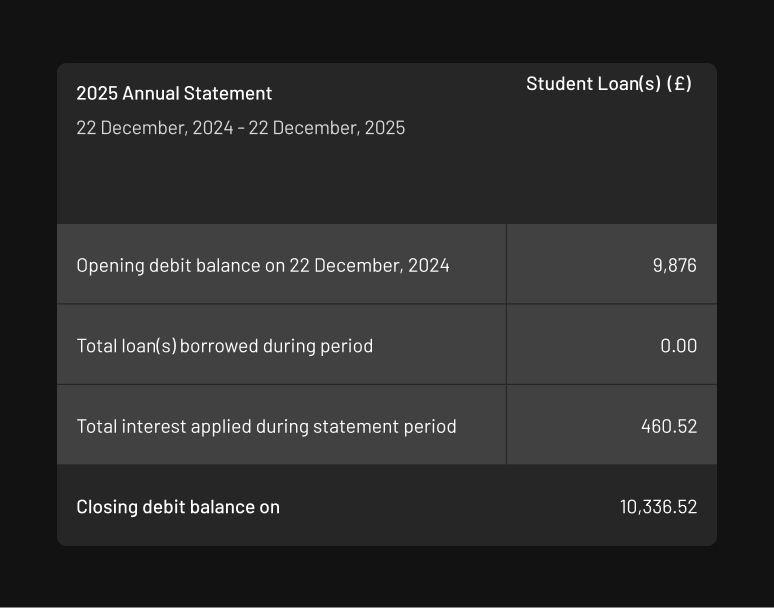
Comprehensible formatting

Stripped away dense spreadsheet formatting in favor of clean, highly readable visual hierarchies.

Why it worked

Centralizing correspondence with inline previews killed forced downloads and page-hunting. Clean table layouts and smart search now let users find and read statements in seconds.

Personal Details

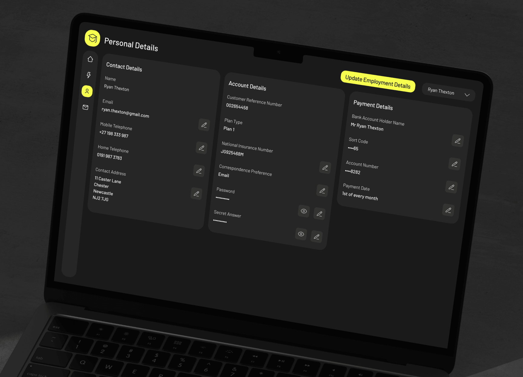
Scattered personal data was replaced with a centralised management hub, bringing all view-and-edit capabilities into one clear location.

Update important details

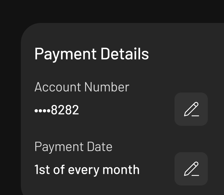
Simplified updating key payment details and choosing payment dates.

View key account info

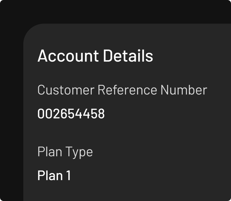
Surfaced and grouped previously hidden account details for immediate visibility.

Why it worked

Displaying hidden account details and centralizing payment controls eliminated the guesswork—turning a clunky administrative chore into an effortless, self-serve flow.