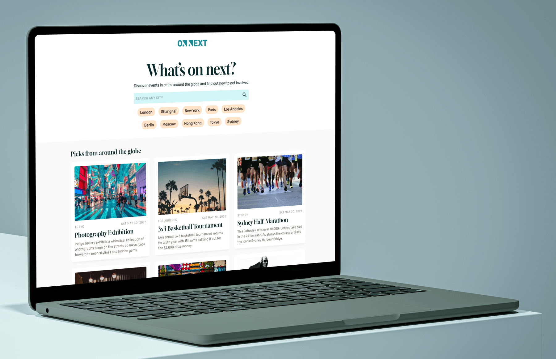
I aimed to build a global city guide prioritising clarity over endless listings, designing an intuitive user flow that cuts through the visual noise.
Project Summary
The Project
This project reimagines global city guides like Time Out. While those platforms often overwhelm users with clutter, my goal was to keep the experience incredibly simple, informative, and helpful.
The Role
As this was a peronal project I was responsible for all visuals/layout and user experience.
Landing Page
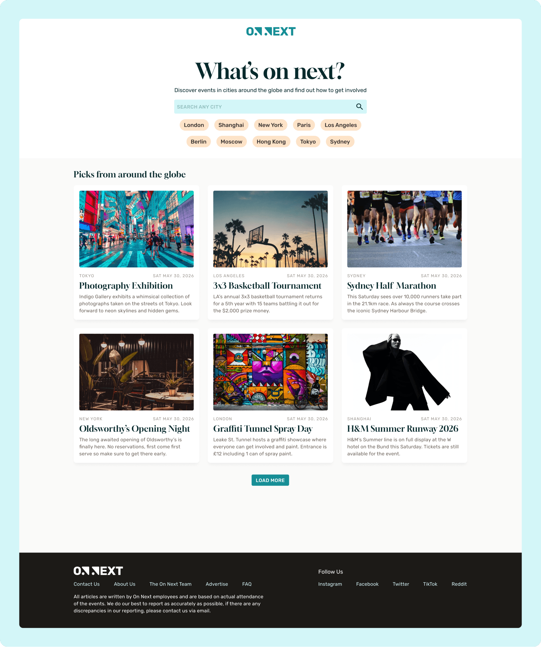
Serving as a gateway to any destination, the landing page lets users find a city via search or helpful category tags. Prominent displays of trending global events further encourage users to discover new cities.
Select or Search
The flexibility to either search or select a city lets users quickly zero in on their specific destination or discover what is happening in a new city of interest.
Selective Loading
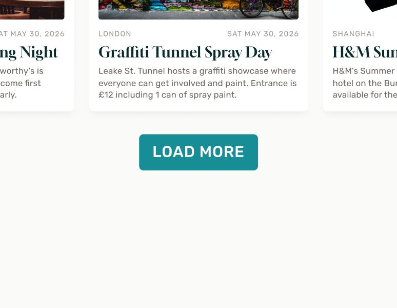
Lazy loading deliberately minimizes on-screen content until requested, creating a more intentional and focused user experience.
Why it worked
This page succeeds by balancing two distinct user mindsets: a central search bar caters to direct, specific intent, while the trending event section offers unexpected discovery for users seeking inspiration.
City Detail
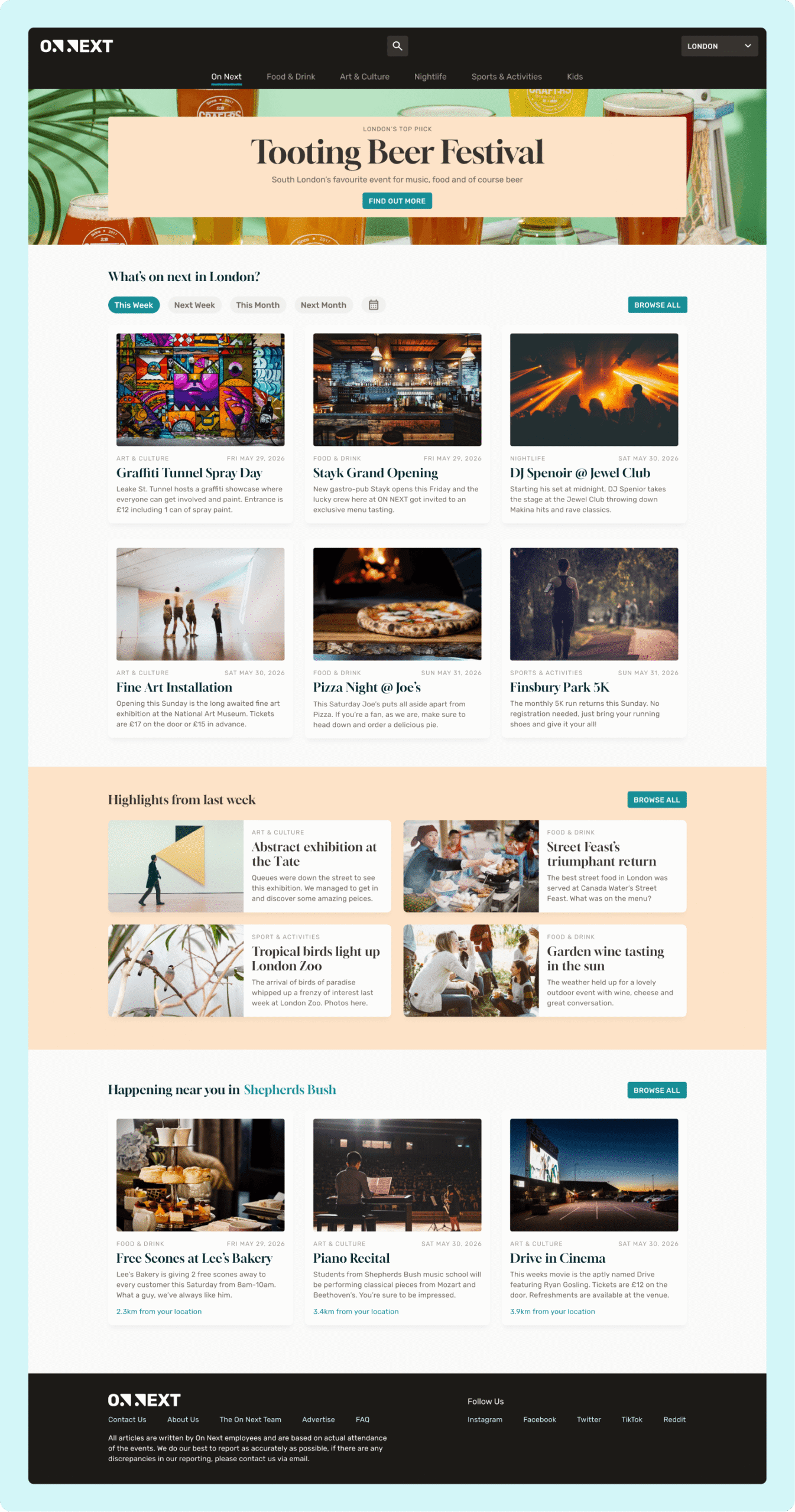
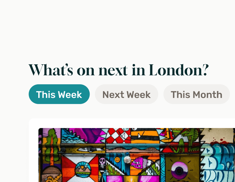
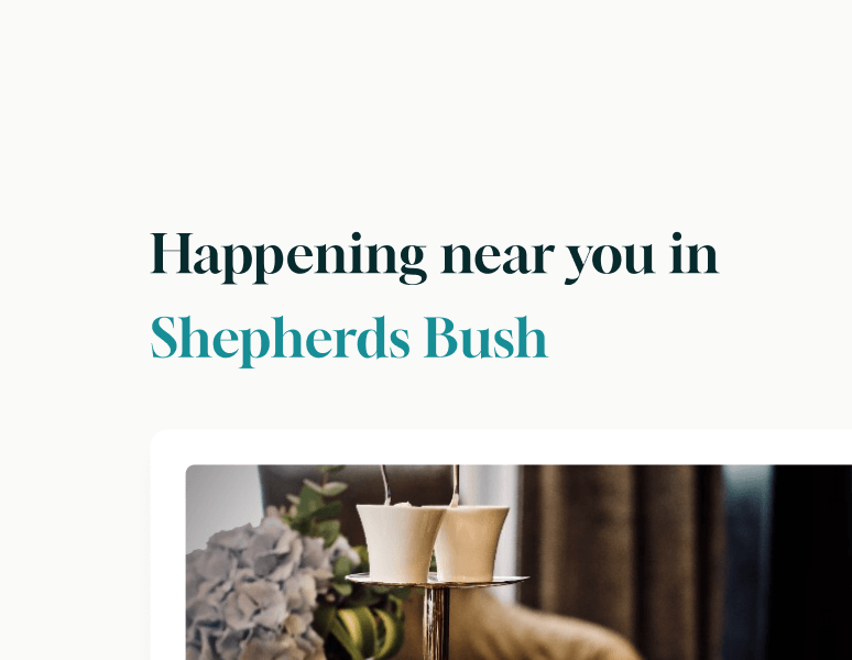
Upon selecting a city, users enter a localized hub showcasing featured highlights, upcoming schedules, past event coverage, and regional recommendations tailored to their exact location.
Logical grouping
Events are grouped into intuitive timeframes like "This Week" and "Next Week," directly matching how users naturally plan their schedules.
Localised suggestions
This section adds a personalised feel by surfacing local events, acting as a valuable discovery feature that improves overall relevance for the user.
Why it worked
This page succeeds by offering both structured search filters and curated content sections, the layout feels comprehensive while allowing for organic exploration.
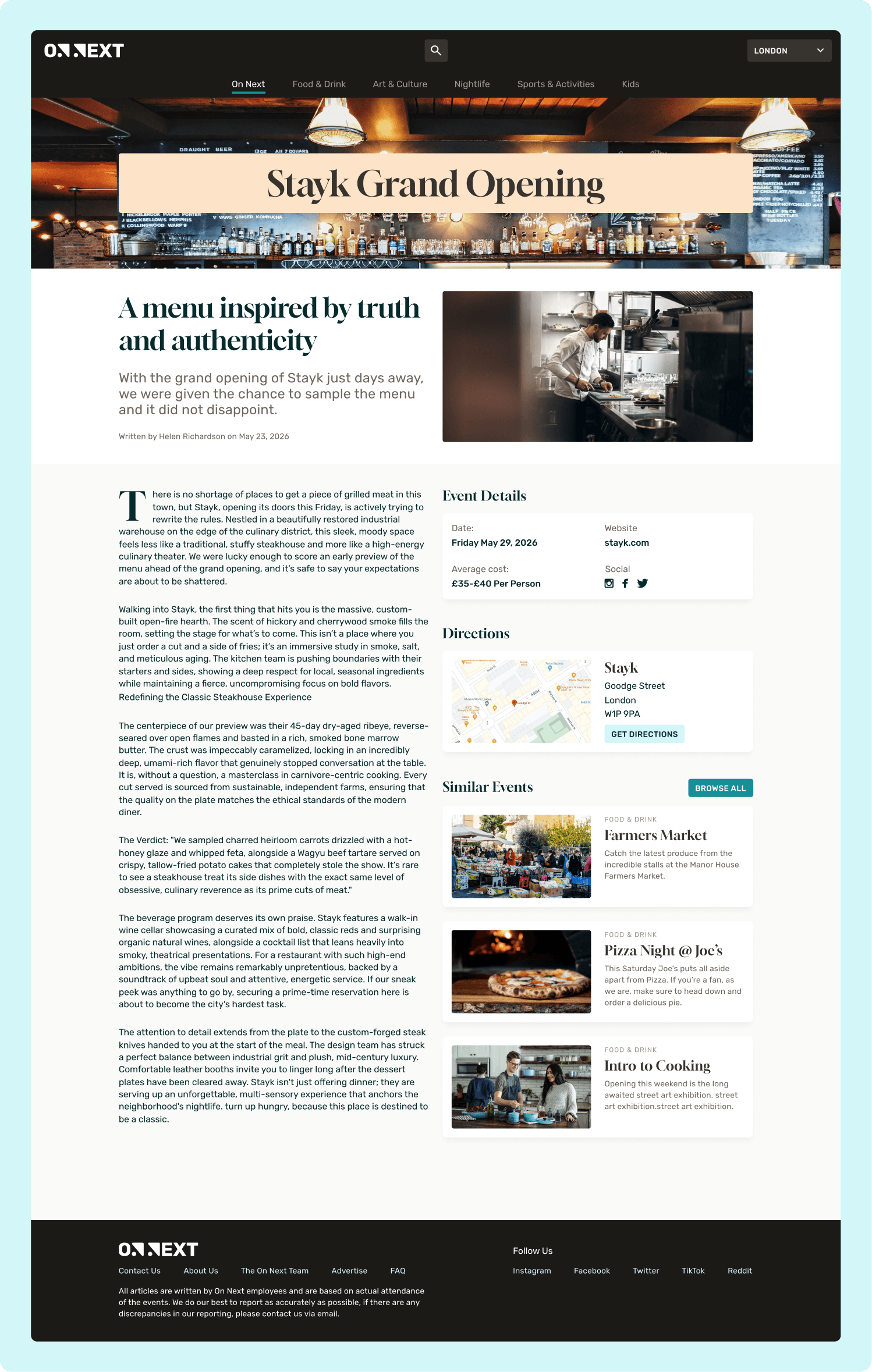
Event Detail
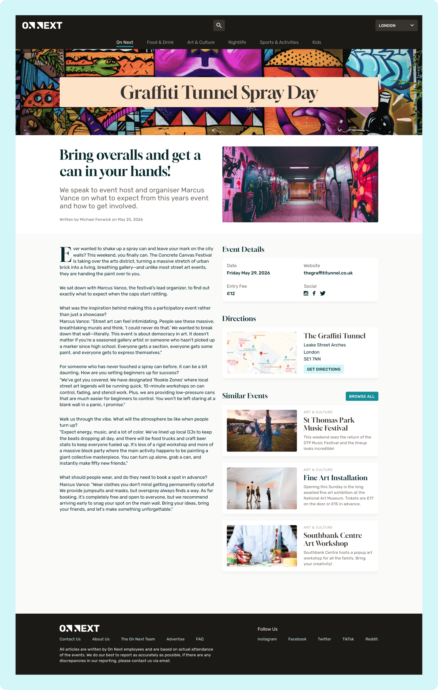
This page cleanly organises the editorial review and event details into an uncluttered layout. The write-up takes centre stage, while critical data like price and location remain easily accessible alongside recommendations for continued discovery.
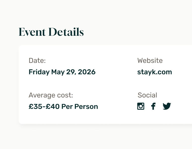
Clearly listed details
Key details are grouped into a dedicated area, making critical information like pricing and contact details easily scannable.
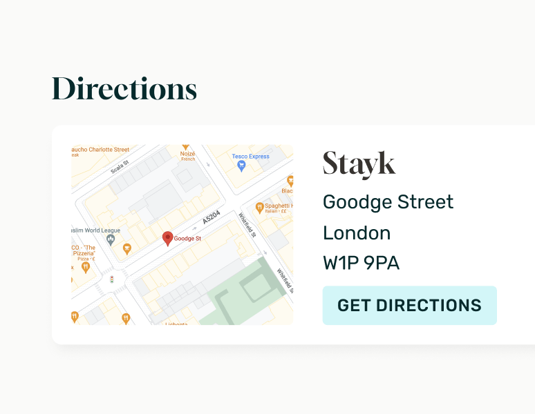
How to get there?
Including the address, map preview, and directions provides users with all the context needed to navigate to the event.
Why it worked
The page works by balancing deep engagement with quick utility. Users can easily immerse themselves in the editorial write-up, while those ready to attend can instantly access critical logistical data, maps, and directions.