A solo-managed private commission translating the agency's vision into a cohesive brand identity and a streamlined website.
The Logo
The brief called for a timeless logo with an approachable aesthetic. I achieved this by softening the logotype and introducing a few distinctive visual elements.
Rounded Font
Colour Distinction
Full Stop
Rounded Font
Approachable Welcoming
Distinction
Informative Playful
Full Stop
Content Happy
The Icon
Contently minimalist "C." icon uses the bold yellow full stop to symbolise fulfillment.
Full Colour on White
Full Colour on Black
Black on White
The Colours
A bold, friendly yellow is paired with minimal supporting tones to create a clean visual identity.
Primary Yellow
Light Grey
Dark Grey
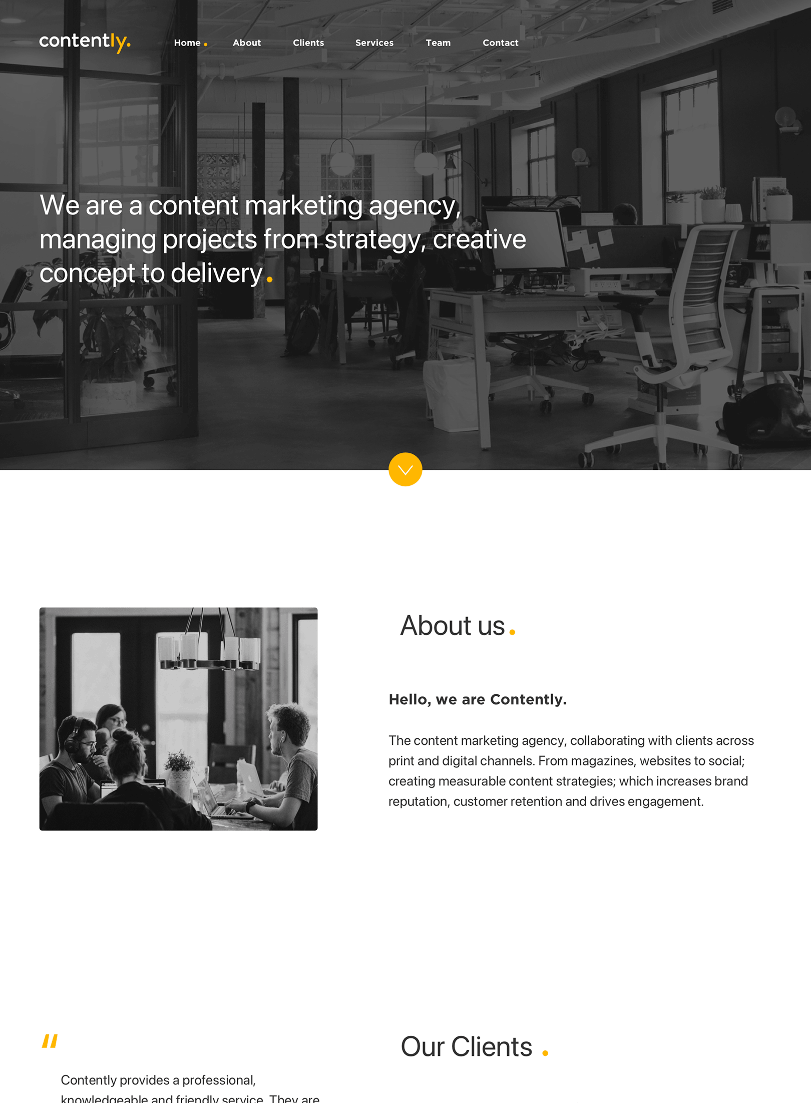
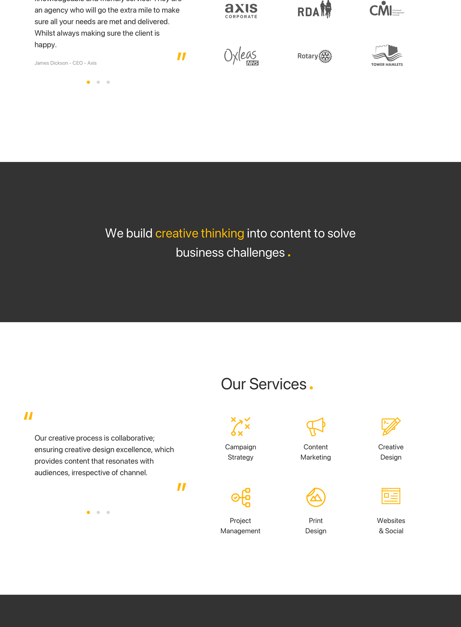
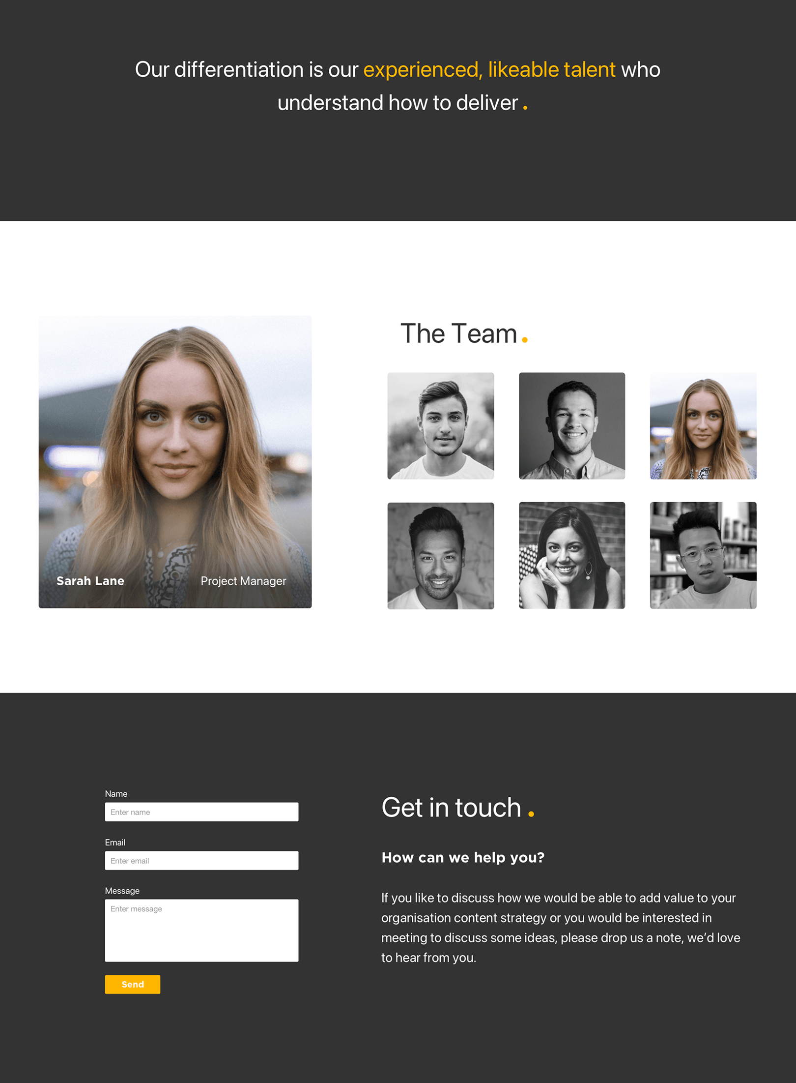
The Desktop Site
The goal here was to showcase enough insight to win clients, while making the content easy to digest.
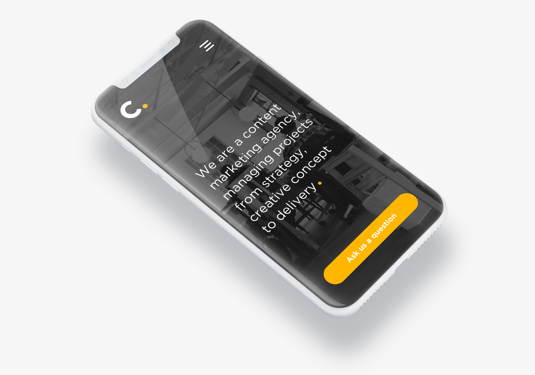
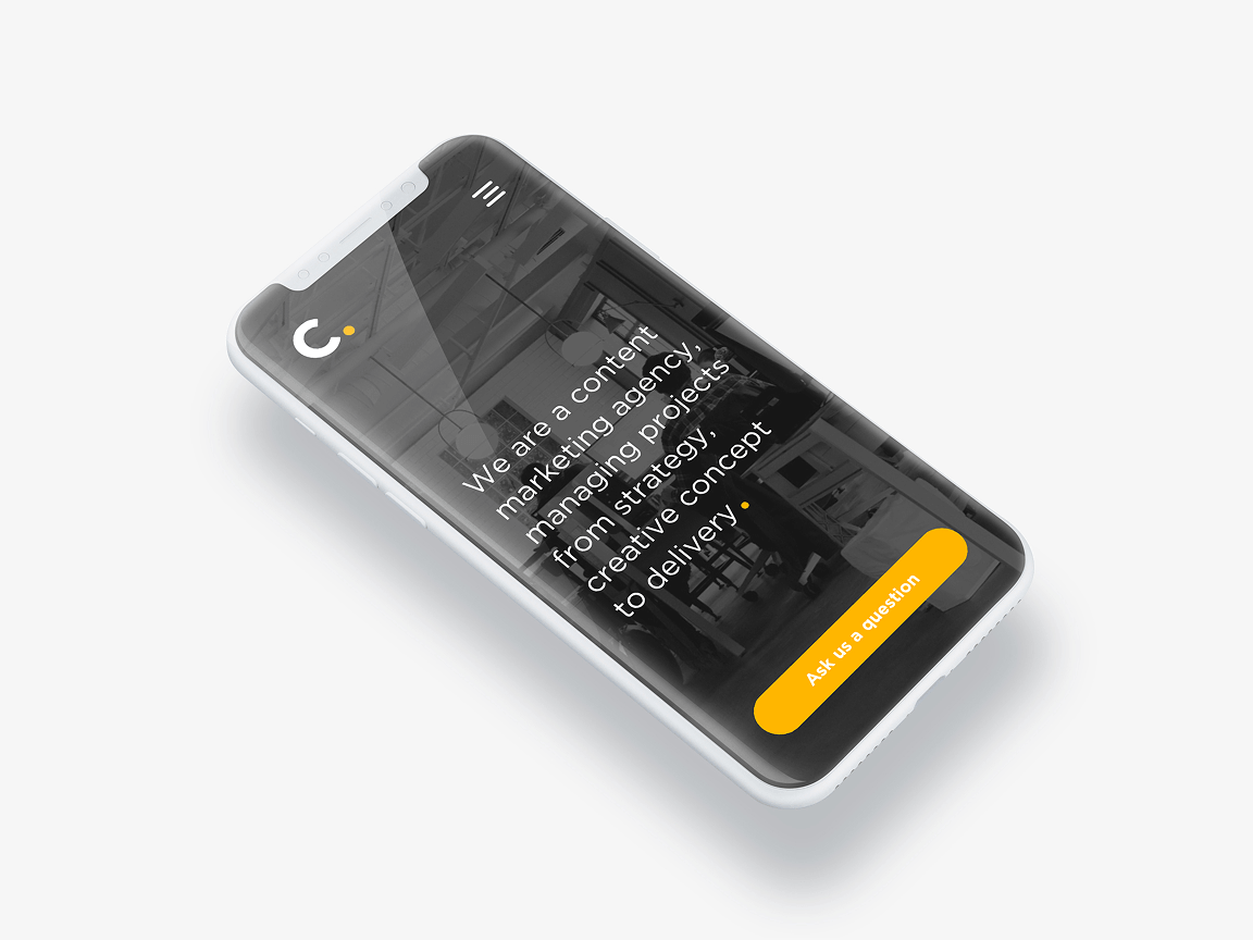
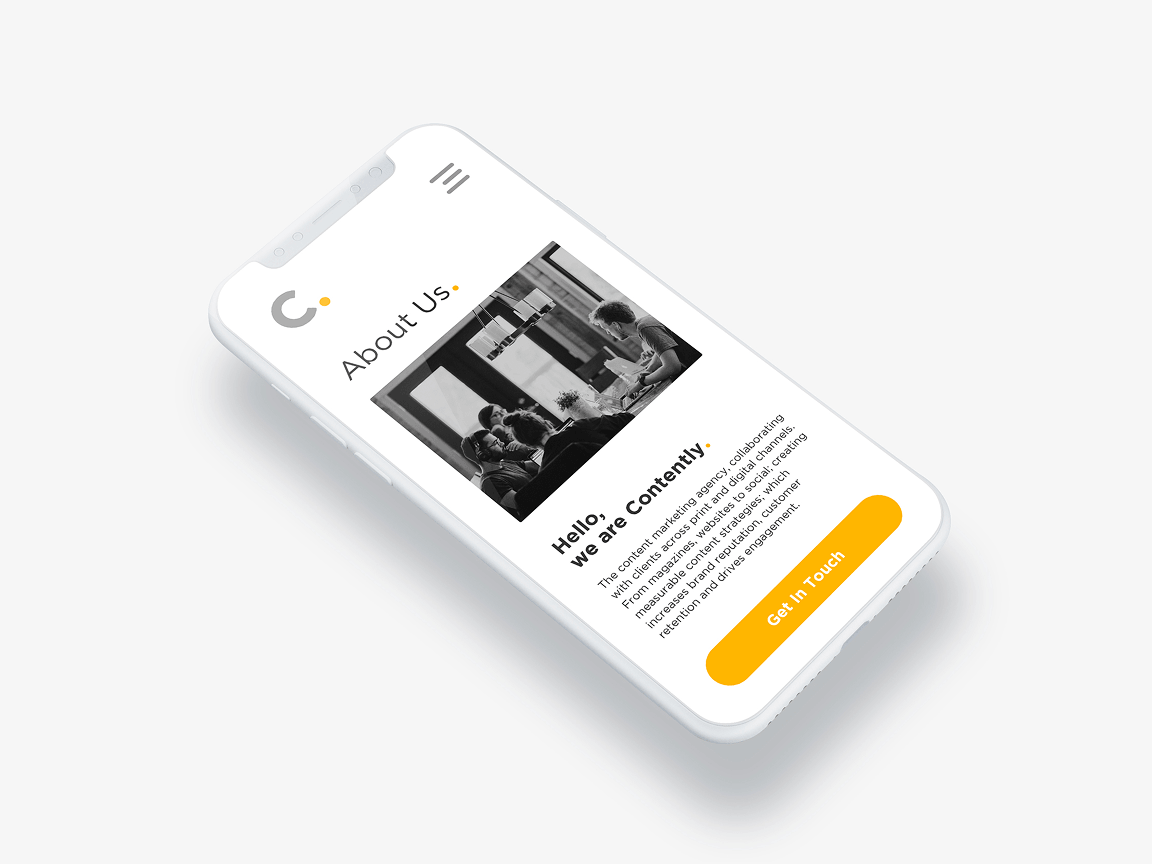
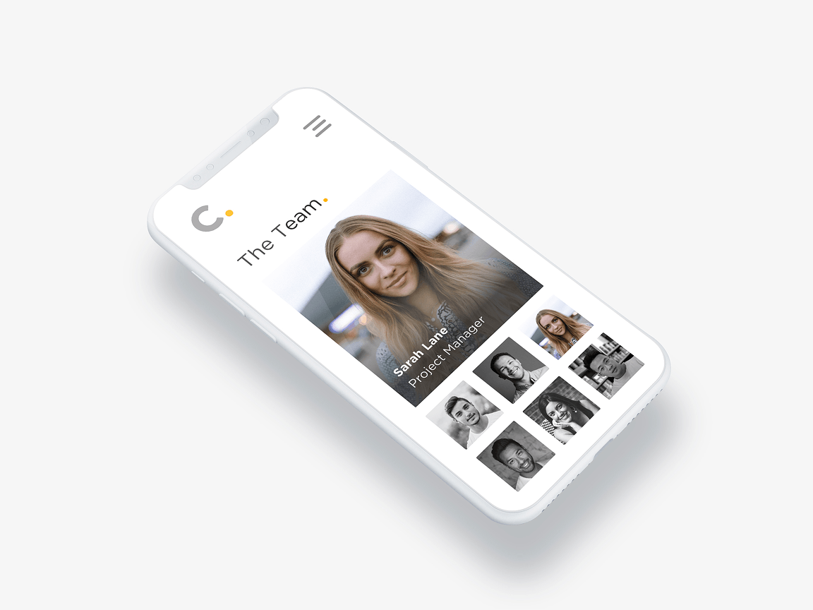
The Mobile Site
The website was optimised for mobile with non-scrolling, full-screen sections.